Modern Somm
Sector
Hospitality
& Restaurant Tech
My role:
Art Direction
Branding,
Product Design,
Jun - Jul
2024
More visuals
Brand concepts
Case Study
Context
Restaurants often have a hard time helping guests pick wine. Menus are usually long, generic, and don’t really guide the experience. Guests feel unsure, and restaurants miss out on upselling opportunities.
Goal
The idea was to explore an AI-powered app that makes wine selection easier and more personal. For us, the design task was not to build the code, but to shape the brand, map out the user journey, and test the concept through prototypes.
What I Did in This Project
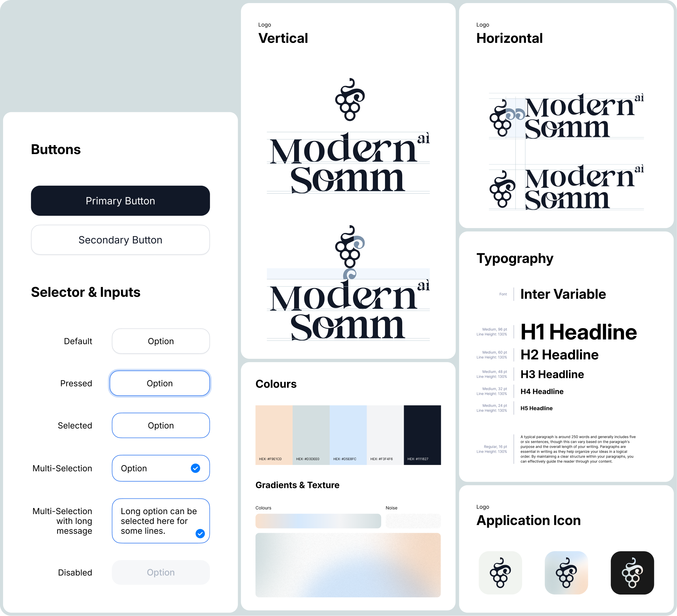
I worked closely with the client to figure out how this product should look and feel. We talked through the details, reviewed market expectations, and defined who exactly we were designing for. I sketched out a bunch of logo and style options, some felt too luxury, others too playful, until we landed on a version that matched the product’s tone. To keep things consistent, I also pulled together a small design library with core UI pieces that we could reuse later.
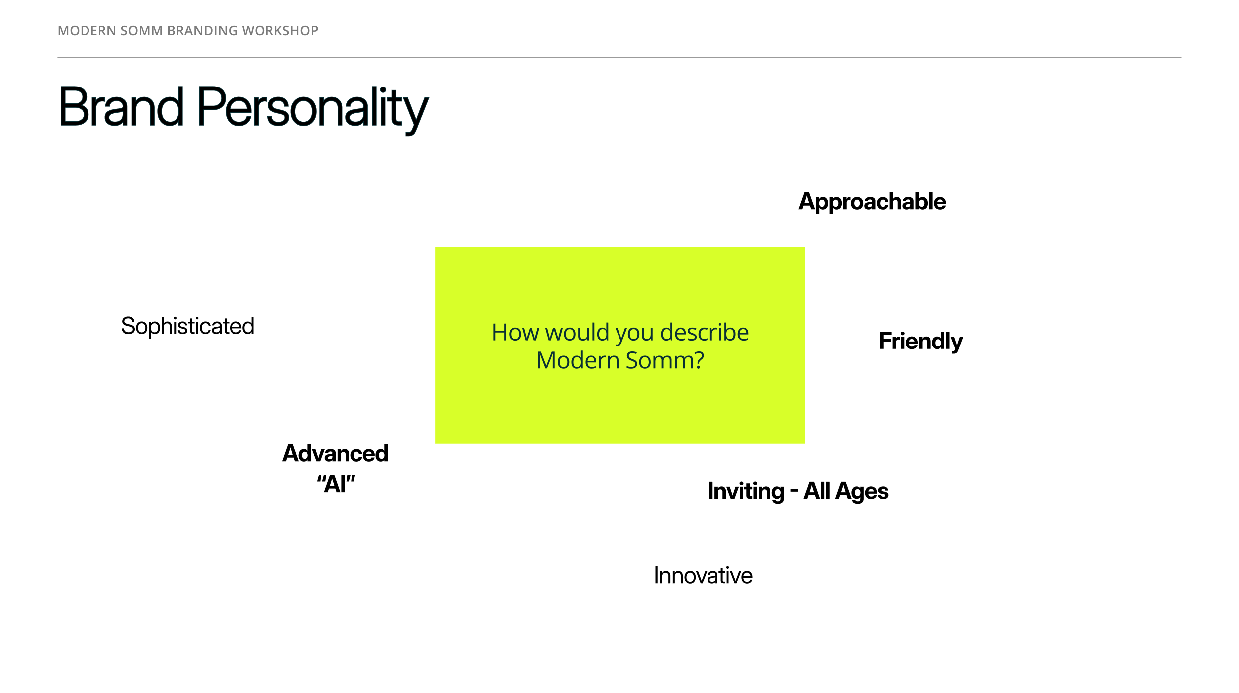
Brand Personality
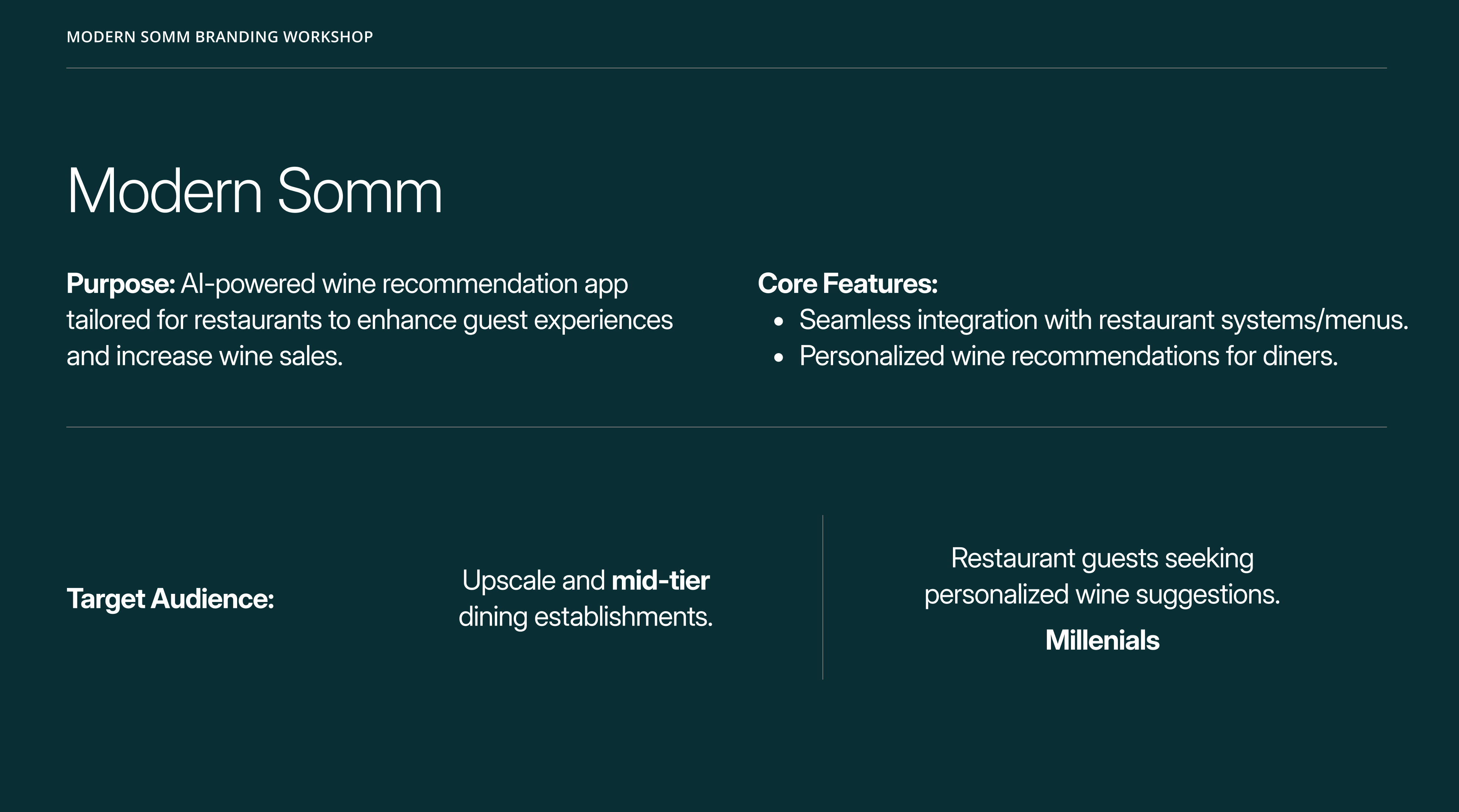
During the workshop, we discussed how users should perceive Modern Somm. Together with the client, we identified the brand’s key traits:
- Modern and innovative, yet approachable and friendly.
- Tech-driven (AI-powered), but still clear and accessible to all age groups.
- A balance of sophistication and simplicity, making it relevant for both upscale and mid-tier restaurants.
During the workshop, we had a detailed discussion with the client about the app’s purpose, key features, and audience. This helped align branding and UX decisions with the product’s market positioning and the needs of its future users.
Brand Attributes
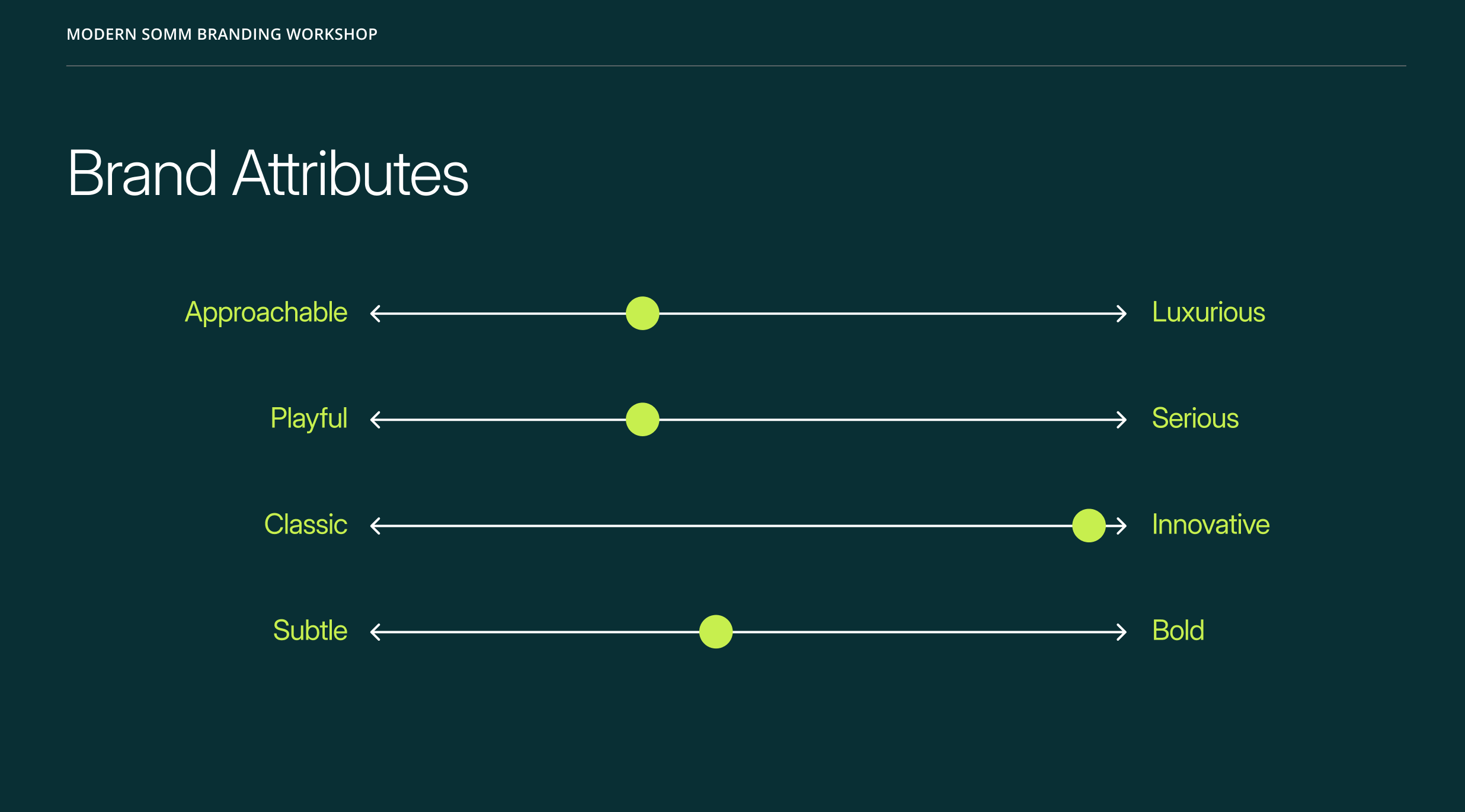
- To capture the positioning more precisely, we mapped out where the brand sits between core attributes:
- Approachable ↔ Luxurious → striking a balance between accessibility and premium appeal.
- Playful ↔ Serious → leaning toward a friendly, welcoming tone.
- Classic ↔ Innovative → emphasizing innovation and fresh solutions.
- Subtle ↔ Bold → understated overall, but with bold accents where it matters.
- These insights became the foundation for future visual style decisions and brand communications.

Solution & My Aproach
Workflow
We also conducted a small-scale market validation to understand user interest in an AI-powered wine recommendation app. Since we’re a boutique agency with limited resources, we focused on lean research methods:
Respondents said
Survey & Polls
Distributed quick surveys through restaurant partners’ mailing lists and social media groups. We collected responses from around 120 participants.
User Interviews
Held short interviews with 10 frequent restaurant-goers, discussing how they currently choose wine and their openness to AI recommendations.
Landing Page Test
Created a simple landing page describing the concept and tracked sign-up intent. About 28% of visitors left their email to learn more.
Upscale restaurants showed more enthusiasm, but mid-tier venues also highlighted potential to boost wine sales.
Unsure selecting wine
65%
Strong interest
42%
Age distribution:
Interest was highest among diners aged 25–40, aligning with millennial demographics.
Older generations showed lower adoption intent, reflecting a more cautious attitude toward new applications and digital products in general.
Who We Designed For - User Personas
To make sure our design decisions aligned with real-world needs, we created four user personas. They helped us frame different mindsets and expectations, from curious millennials to more traditional diners — and guided choices around branding, user flows, and interface tone. These personas became a practical tool for prioritizing features, simplifying steps, and making the app approachable for a diverse audience.
The Curious Explorer
25–35 y.o.
Tech-savvy millennials who love trying new restaurants and aren’t afraid of apps. They want quick, fun recommendations without reading long descriptions.
Impact:
Prioritized a smooth onboarding and conversational flow that feels natural and playful.
The Romantic Guest
30–45 y.o.
Couples on a date night, looking to impress and create a special atmosphere. They want a bit of storytelling and “wow factor” in recommendations.
Impact:
Inspired us to weave in a touch of descriptive language in the UI, making wine suggestions feel more curated and personal.
The Business Diner
35–50 y.o.
Professionals entertaining clients or colleagues. They value confidence in their wine choice — it’s less about learning, more about looking knowledgeable.
Impact:
Added concise “confidence-building” cues and highlighted safe, reputable wine suggestions.
The Traditionalist
50+ y.o.
Guests who are skeptical about new digital tools but open to guidance if the app feels reliable and simple.
Impact:
Pushed us to simplify the flow, reduce unnecessary steps, and keep the interface clear, without overwhelming details.
CJM
To make sure our design decisions aligned with real-world needs, we created four user personas. They helped us frame different mindsets and expectations, from curious millennials to more traditional diners — and guided choices around branding, user flows, and interface tone. These personas became a practical tool for prioritizing features, simplifying steps, and making the app approachable for a diverse audience.
Opens the app

Receives a personalized wine recommendation
Places the order
Gets confirmation from the server
Shares the experience
Guest arrives at the restaurant
Notices a QR code


Next, I moved on to developing the brand and visual identity for the future SaaS product. I explored several logo and branding concepts, testing different directions to find the right balance between sophistication and accessibility. Together with the client, we refined these ideas and arrived at a final version of the brand identity.
To support consistency in the product’s growth, I also created a small design system library - a set of core UI components and style guidelines that could scale with future iterations of the app.
Products
Investment products highlights
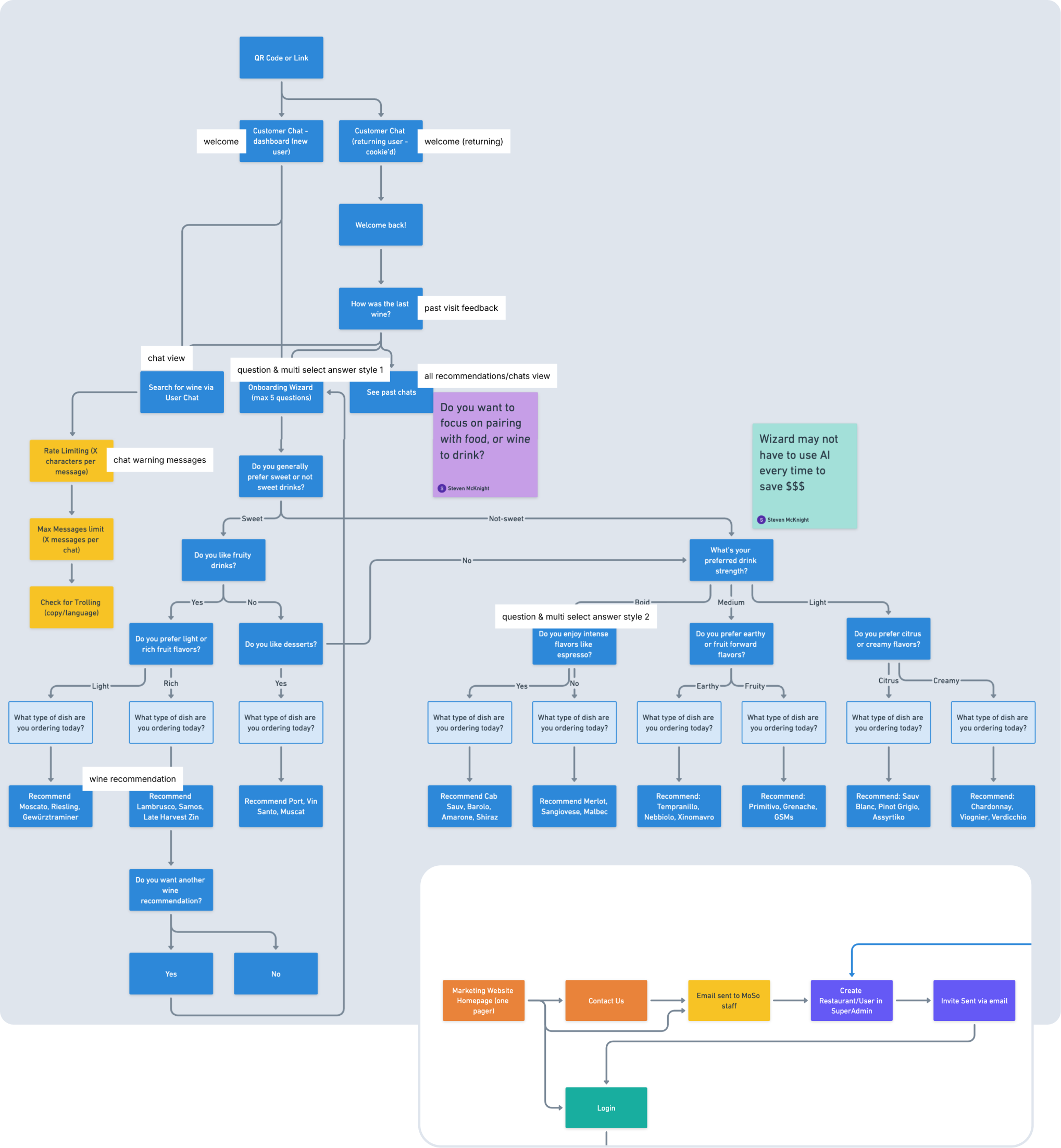
This was already the second iteration of the user flow. The first version had way more steps, and once I mapped it all out, it became obvious that some paths were just too heavy. By zooming out and looking at the full picture, I spotted where users might drop off, too many questions in a row, unclear branching, unnecessary confirmations.
So I trimmed down the flow, merged a few decision points, and simplified the entry path. The result was a cleaner, more intuitive journey: fewer clicks, less friction, and higher chances that users actually complete the flow instead of abandoning it halfway.
This solution improved content delivery and reduced the load on the support team by making it easier for users to understand the key differences between funds, their benefits, limitations, and potential risks. According to the client, the number of simple and repetitive support inquiries decreased by about 20%.

Design
Investment products highlights
I worked on the animation of the wine drop – designed to become a living avatar of the AI inside the app. The animation was meant to bring warmth and a sense of presence into the interaction, showing that the AI is not just a static tool but something alive, breathing, moving, and evolving.
The drop shifted through shades inspired by different wine profiles, from classic deep reds to fresh, fruity tones. This visual metaphor helped create an emotional connection and made every interaction with the AI feel more engaging and human.
Design
Investment products highlights
First scenario
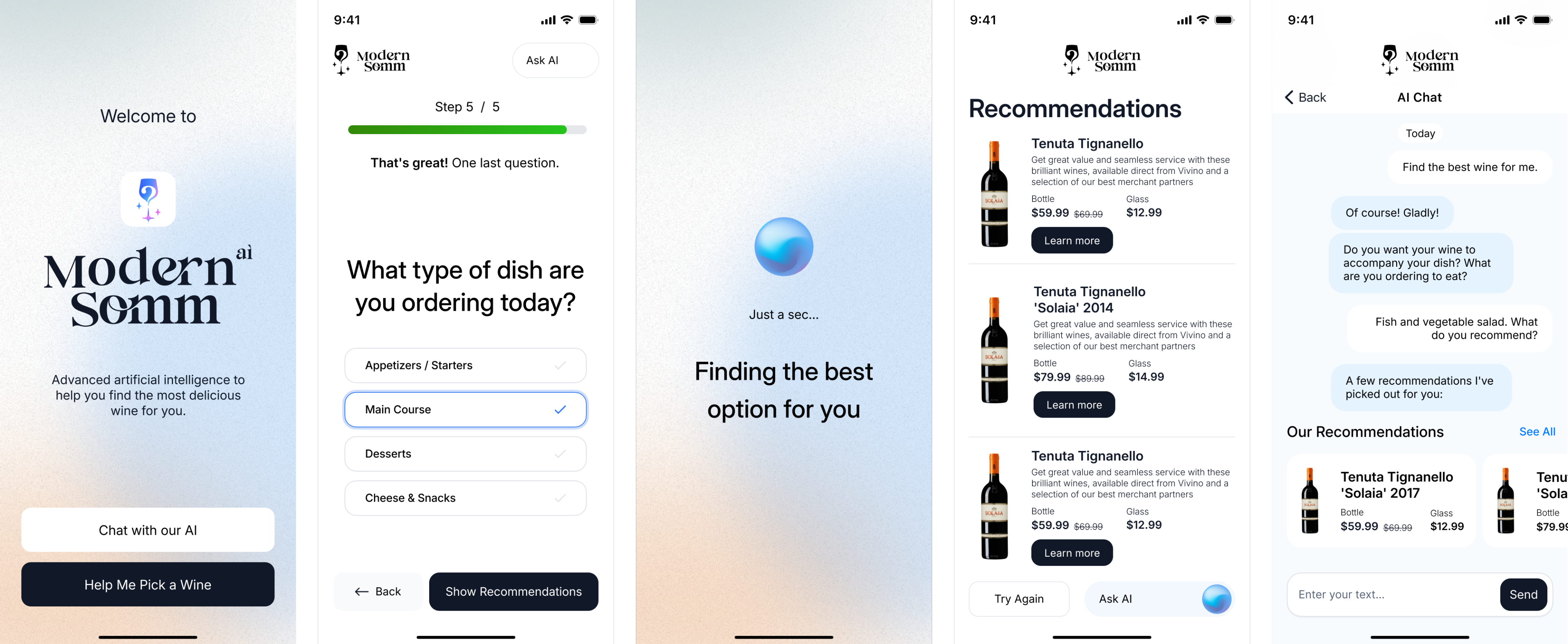
The first path was a simple 5-step guided flow. Users who might feel less confident with tech or just unsure how to start could answer a short series of multiple-choice questions. This acted as a friendly guide, helping them quickly reach relevant wine suggestions without needing to “figure out” how to talk to an AI.
Second scenario
The second path was a more flexible chat experience. Here, users could type freely and interact with the AI however they wanted. During design workshops and close collaboration with developers, I pushed for an additional option, pre-built answers inside the chat. This way, users could either write in their own words or select suggested replies. It gave the conversation structure, reduced friction, and still left room for personal choice.
Both paths complemented each other: the guided flow supported hesitant users, while the chat with selectable answers gave more confident users freedom without losing direction.
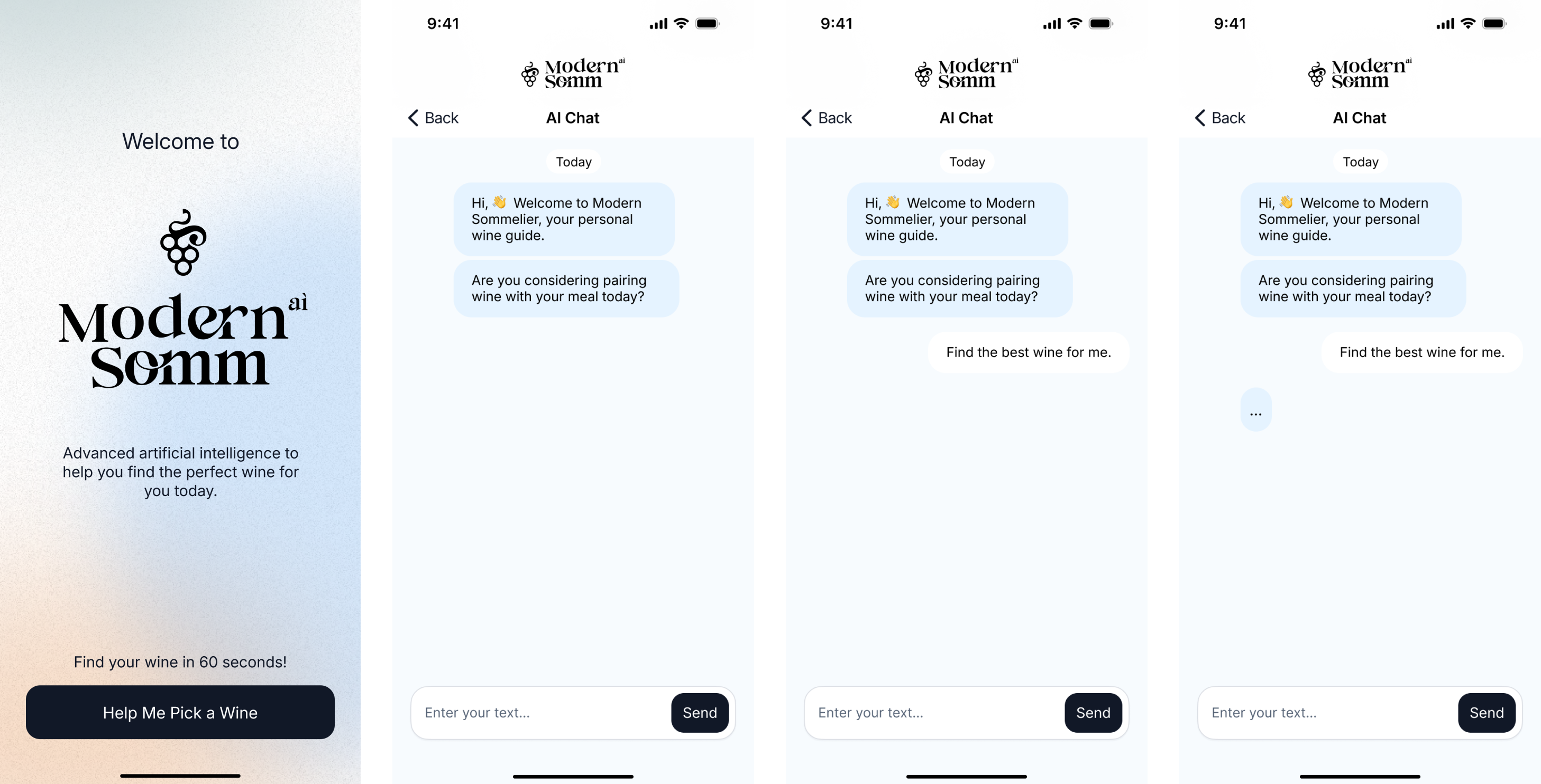
Initially, the chat was designed to work as a straightforward messenger-style dialogue: the user types, the AI responds. While this approach felt natural, it also created extra friction for people who wanted quick results without spending time typing.
I suggested adding predefined answer options directly into the chat. At first, this idea met resistance, after all, we already had a guided flow with multiple-choice questions, and the team felt it might duplicate functionality. However, I argued that this was not about duplicating, but about giving the user flexibility.
Predefined answers inside the chat would allow two things:
- Save time for the user, no need to type every response manually.
- Make AI replies more accurate, structured input helps guide the conversation and reduces misunderstandings.
To facilitate discussion with the team, I also prepared sketches showing different answer lengths and formats, from very short one-word replies to more detailed options. This helped us see how the interaction would feel in real use and sparked valuable conversation about balance between speed and clarity.
To bring the idea to life, I created an interactive MVP prototype. The goal was to show how the app actually feels in use: from onboarding to chat-based wine recommendations. The video demonstrates the full flow, giving a sense of how users move through the experience, and how the interface supports both guided steps and free chat. This early prototype helped the team validate core interactions quickly and align on next steps before investing in development.

Solution & My Aproach
Areas for Improvement
Conclusion
What I Would Improve
Looking back, there are a few things I would improve in the next iteration. I would simplify the onboarding even further. While five steps worked for most users, some still felt it was a bit long, and shortening that path could help reduce drop-offs.
I would also make the conversation feel more natural. The predefined responses performed well, but giving users more flexibility to express themselves in their own words would make the experience feel more human.
Personalization is another area I would expand. Recommendations could take into account not only the dish itself, but also the context, such as the occasion or the user’s budget.
Finally, I would test the product in real restaurant environments. Piloting it with actual diners and staff would likely reveal practical usability insights that are hard to fully capture in prototypes.


Next
Case


Digital Product Designer

My LinkedIn
Modern Somm
Sector
Hospitality
& Restaurant Tech
My role:
Timeline
Project on Behance
Art Direction
Branding,
Product Design,
Jun - Jul
2024
More visuals
Brand concepts
Case Study
Context
Restaurants often have a hard time helping guests pick wine. Menus are usually long, generic, and don’t really guide the experience. Guests feel unsure, and restaurants miss out on upselling opportunities.
Goal
The idea was to explore an AI-powered app that makes wine selection easier and more personal. For us, the design task was not to build the code, but to shape the brand, map out the user journey, and test the concept through prototypes.
What I Did in This Project
I worked closely with the client to figure out how this product should look and feel. We talked through the details, reviewed market expectations, and defined who exactly we were designing for. I sketched out a bunch of logo and style options, some felt too luxury, others too playful, until we landed on a version that matched the product’s tone. To keep things consistent, I also pulled together a small design library with core UI pieces that we could reuse later.
Brand Personality
During the workshop, we discussed how users should perceive Modern Somm. Together with the client, we identified the brand’s key traits:
- Modern and innovative, yet approachable and friendly.
- Tech-driven (AI-powered), but still clear and accessible to all age groups.
- A balance of sophistication and simplicity, making it relevant for both upscale and mid-tier restaurants.
During the workshop, we had a detailed discussion with the client about the app’s purpose, key features, and audience. This helped align branding and UX decisions with the product’s market positioning and the needs of its future users.
Brand Attributes
- To capture the positioning more precisely, we mapped out where the brand sits between core attributes:
- Approachable ↔ Luxurious → striking a balance between accessibility and premium appeal.
- Playful ↔ Serious → leaning toward a friendly, welcoming tone.
- Classic ↔ Innovative → emphasizing innovation and fresh solutions.
- Subtle ↔ Bold → understated overall, but with bold accents where it matters.
- These insights became the foundation for future visual style decisions and brand communications.
Solution & My Aproach
Workflow
We also conducted a small-scale market validation to understand user interest in an AI-powered wine recommendation app. Since we’re a boutique agency with limited resources, we focused on lean research methods:
Respondents said
Survey & Polls
Distributed quick surveys through restaurant partners’ mailing lists and social media groups. We collected responses from around 120 participants.
User Interviews
Held short interviews with 10 frequent restaurant-goers, discussing how they currently choose wine and their openness to AI recommendations.
Landing Page Test
Created a simple landing page describing the concept and tracked sign-up intent. About 28% of visitors left their email to learn more.
Upscale restaurants showed more enthusiasm, but mid-tier venues also highlighted potential to boost wine sales.
Unsure selecting wine
65%
Strong interest
42%
Age distribution:
Interest was highest among diners aged 25–40, aligning with millennial demographics.
Older generations showed lower adoption intent, reflecting a more cautious attitude toward new applications and digital products in general.
Who We Designed For - User Personas
To make sure our design decisions aligned with real-world needs, we created four user personas. They helped us frame different mindsets and expectations, from curious millennials to more traditional diners — and guided choices around branding, user flows, and interface tone. These personas became a practical tool for prioritizing features, simplifying steps, and making the app approachable for a diverse audience.
The Curious Explorer
25–35 y.o.
Tech-savvy millennials who love trying new restaurants and aren’t afraid of apps. They want quick, fun recommendations without reading long descriptions.
Impact:
Prioritized a smooth onboarding and conversational flow that feels natural and playful.
The Romantic Guest
30–45 y.o.
Couples on a date night, looking to impress and create a special atmosphere. They want a bit of storytelling and “wow factor” in recommendations.
Impact:
Inspired us to weave in a touch of descriptive language in the UI, making wine suggestions feel more curated and personal.
The Business Diner
35–50 y.o.
Professionals entertaining clients or colleagues. They value confidence in their wine choice — it’s less about learning, more about looking knowledgeable.
Impact:
Added concise “confidence-building” cues and highlighted safe, reputable wine suggestions.
The Traditionalist
50+ y.o.
Guests who are skeptical about new digital tools but open to guidance if the app feels reliable and simple.
Impact:
Pushed us to simplify the flow, reduce unnecessary steps, and keep the interface clear, without overwhelming details.
CJM
To make sure our design decisions aligned with real-world needs, we created four user personas. They helped us frame different mindsets and expectations, from curious millennials to more traditional diners — and guided choices around branding, user flows, and interface tone. These personas became a practical tool for prioritizing features, simplifying steps, and making the app approachable for a diverse audience.
Opens the app

Receives a personalized wine recommendation
Places the order
Gets confirmation from the server
Shares the experience
Guest arrives at the restaurant
Notices a QR code


Next, I moved on to developing the brand and visual identity for the future SaaS product. I explored several logo and branding concepts, testing different directions to find the right balance between sophistication and accessibility. Together with the client, we refined these ideas and arrived at a final version of the brand identity.
To support consistency in the product’s growth, I also created a small design system library - a set of core UI components and style guidelines that could scale with future iterations of the app.
Products
Investment products highlights
This was already the second iteration of the user flow. The first version had way more steps, and once I mapped it all out, it became obvious that some paths were just too heavy. By zooming out and looking at the full picture, I spotted where users might drop off, too many questions in a row, unclear branching, unnecessary confirmations.
So I trimmed down the flow, merged a few decision points, and simplified the entry path. The result was a cleaner, more intuitive journey: fewer clicks, less friction, and higher chances that users actually complete the flow instead of abandoning it halfway.
This solution improved content delivery and reduced the load on the support team by making it easier for users to understand the key differences between funds, their benefits, limitations, and potential risks. According to the client, the number of simple and repetitive support inquiries decreased by about 20%.
Design
Investment products highlights
I worked on the animation of the wine drop – designed to become a living avatar of the AI inside the app. The animation was meant to bring warmth and a sense of presence into the interaction, showing that the AI is not just a static tool but something alive, breathing, moving, and evolving.
The drop shifted through shades inspired by different wine profiles, from classic deep reds to fresh, fruity tones. This visual metaphor helped create an emotional connection and made every interaction with the AI feel more engaging and human.
Design
Investment products highlights
First scenario
The first path was a simple 5-step guided flow. Users who might feel less confident with tech or just unsure how to start could answer a short series of multiple-choice questions. This acted as a friendly guide, helping them quickly reach relevant wine suggestions without needing to “figure out” how to talk to an AI.
Second scenario
The second path was a more flexible chat experience. Here, users could type freely and interact with the AI however they wanted. During design workshops and close collaboration with developers, I pushed for an additional option, pre-built answers inside the chat. This way, users could either write in their own words or select suggested replies. It gave the conversation structure, reduced friction, and still left room for personal choice.
Both paths complemented each other: the guided flow supported hesitant users, while the chat with selectable answers gave more confident users freedom without losing direction.
Initially, the chat was designed to work as a straightforward messenger-style dialogue: the user types, the AI responds. While this approach felt natural, it also created extra friction for people who wanted quick results without spending time typing.
I suggested adding predefined answer options directly into the chat. At first, this idea met resistance, after all, we already had a guided flow with multiple-choice questions, and the team felt it might duplicate functionality. However, I argued that this was not about duplicating, but about giving the user flexibility.
Predefined answers inside the chat would allow two things:
- Save time for the user, no need to type every response manually.
- Make AI replies more accurate, structured input helps guide the conversation and reduces misunderstandings.
To facilitate discussion with the team, I also prepared sketches showing different answer lengths and formats, from very short one-word replies to more detailed options. This helped us see how the interaction would feel in real use and sparked valuable conversation about balance between speed and clarity.
To bring the idea to life, I created an interactive MVP prototype. The goal was to show how the app actually feels in use: from onboarding to chat-based wine recommendations. The video demonstrates the full flow, giving a sense of how users move through the experience, and how the interface supports both guided steps and free chat. This early prototype helped the team validate core interactions quickly and align on next steps before investing in development.
Solution & My Aproach
Areas for Improvement
Conclusion
What I Would Improve
Looking back, there are a few things I would improve in the next iteration. I would simplify the onboarding even further. While five steps worked for most users, some still felt it was a bit long, and shortening that path could help reduce drop-offs.
I would also make the conversation feel more natural. The predefined responses performed well, but giving users more flexibility to express themselves in their own words would make the experience feel more human.
Personalization is another area I would expand. Recommendations could take into account not only the dish itself, but also the context, such as the occasion or the user’s budget.
Finally, I would test the product in real restaurant environments. Piloting it with actual diners and staff would likely reveal practical usability insights that are hard to fully capture in prototypes.
Next
Case
Digital Product Designer
My LinkedIn
Modern Somm
Sector
Hospitality
& Restaurant Tech
My role:
Timeline
Project on Behance
Art Direction
Branding,
Product Design,
Case Study
Context
Restaurants often have a hard time helping guests pick wine. Menus are usually long, generic, and don’t really guide the experience. Guests feel unsure, and restaurants miss out on upselling opportunities.
Goal
The idea was to explore an AI-powered app that makes wine selection easier and more personal. For us, the design task was not to build the code, but to shape the brand, map out the user journey, and test the concept through prototypes.
What I Did in This Project
I worked closely with the client to figure out how this product should look and feel. We talked through the details, reviewed market expectations, and defined who exactly we were designing for. I sketched out a bunch of logo and style options, some felt too luxury, others too playful, until we landed on a version that matched the product’s tone. To keep things consistent, I also pulled together a small design library with core UI pieces that we could reuse later.
During the workshop, we had a detailed discussion with the client about the app’s purpose, key features, and audience. This helped align branding and UX decisions with the product’s market positioning and the needs of its future users.
Brand Personality
During the workshop, we discussed how users should perceive Modern Somm. Together with the client, we identified the brand’s key traits:
- Modern and innovative, yet approachable and friendly.
- Tech-driven (AI-powered), but still clear and accessible to all age groups.
- A balance of sophistication and simplicity, making it relevant for both upscale and mid-tier restaurants.
Brand Attributes
To capture the positioning more precisely, we mapped out where the brand sits between core attributes:
- Approachable ↔ Luxurious → striking a balance between accessibility and premium appeal.
- Playful ↔ Serious → leaning toward a friendly, welcoming tone.
- Classic ↔ Innovative → emphasizing innovation and fresh solutions.
- Subtle ↔ Bold → understated overall, but with bold accents where it matters.
These insights became the foundation for future visual style decisions and brand communications.
Solution & My Approach
Workflow
We also conducted a small-scale market validation to understand user interest in an AI-powered wine recommendation app. Since we’re a boutique agency with limited resources, we focused on lean research methods:
Respondents said
Survey & Polls
Distributed quick surveys through restaurant partners’ mailing lists and social media groups. We collected responses from around 120 participants.
User Interviews
Held short interviews with 10 frequent restaurant-goers, discussing how they currently choose wine and their openness to AI recommendations.
Landing Page Test
Created a simple landing page describing the concept and tracked sign-up intent. About 28% of visitors left their email to learn more.
Upscale restaurants showed more enthusiasm, but mid-tier venues also highlighted potential to boost wine sales.
Unsure selecting wine
65%
Strong interest
42%
Age distribution:
Interest was highest among diners aged 25–40, aligning with millennial demographics.
Older generations showed lower adoption intent, reflecting a more cautious attitude toward new applications and digital products in general.
Who We Designed For - User Personas
To make sure our design decisions aligned with real-world needs, we created four user personas. They helped us frame different mindsets and expectations, from curious millennials to more traditional diners — and guided choices around branding, user flows, and interface tone. These personas became a practical tool for prioritizing features, simplifying steps, and making the app approachable for a diverse audience.
The Curious Explorer
25–35 y.o.
Tech-savvy millennials who love trying new restaurants and aren’t afraid of apps. They want quick, fun recommendations without reading long descriptions.
Impact:
Prioritized a smooth onboarding and conversational flow that feels natural and playful.
The Romantic Guest
30–45 y.o.
Couples on a date night, looking to impress and create a special atmosphere. They want a bit of storytelling and “wow factor” in recommendations.
Impact:
Inspired us to weave in a touch of descriptive language in the UI, making wine suggestions feel more curated and personal.
The Business Diner
35–50 y.o.
Professionals entertaining clients or colleagues. They value confidence in their wine choice — it’s less about learning, more about looking knowledgeable.
Impact:
Added concise “confidence-building” cues and highlighted safe, reputable wine suggestions.
The Traditionalist
50+ y.o.
Guests who are skeptical about new digital tools but open to guidance if the app feels reliable and simple.
Impact:
Pushed us to simplify the flow, reduce unnecessary steps, and keep the interface clear, without overwhelming details.
CJM
To make sure our design decisions aligned with real-world needs, we created four user personas. They helped us frame different mindsets and expectations, from curious millennials to more traditional diners — and guided choices around branding, user flows, and interface tone. These personas became a practical tool for prioritizing features, simplifying steps, and making the app approachable for a diverse audience.
Opens the app
Receives a personalized wine recommendation
Places the order
Gets confirmation from the server
Shares the experience
Guest arrives at the restaurant
Notices a QR code
Next, I moved on to developing the brand and visual identity for the future SaaS product. I explored several logo and branding concepts, testing different directions to find the right balance between sophistication and accessibility. Together with the client, we refined these ideas and arrived at a final version of the brand identity.
To support consistency in the product’s growth, I also created a small design system library - a set of core UI components and style guidelines that could scale with future iterations of the app.
Products
Designing the User Flow
This was already the second iteration of the user flow. The first version had way more steps, and once I mapped it all out, it became obvious that some paths were just too heavy. By zooming out and looking at the full picture, I spotted where users might drop off, too many questions in a row, unclear branching, unnecessary confirmations.
So I trimmed down the flow, merged a few decision points, and simplified the entry path. The result was a cleaner, more intuitive journey: fewer clicks, less friction, and higher chances that users actually complete the flow instead of abandoning it halfway.
This solution improved content delivery and reduced the load on the support team by making it easier for users to understand the key differences between funds, their benefits, limitations, and potential risks. According to the client, the number of simple and repetitive support inquiries decreased by about 20%.
Design
Bringing AI to Life Through Motion
I worked on the animation of the wine drop – designed to become a living avatar of the AI inside the app. The animation was meant to bring warmth and a sense of presence into the interaction, showing that the AI is not just a static tool but something alive, breathing, moving, and evolving.
The drop shifted through shades inspired by different wine profiles, from classic deep reds to fresh, fruity tones. This visual metaphor helped create an emotional connection and made every interaction with the AI feel more engaging and human.
Design
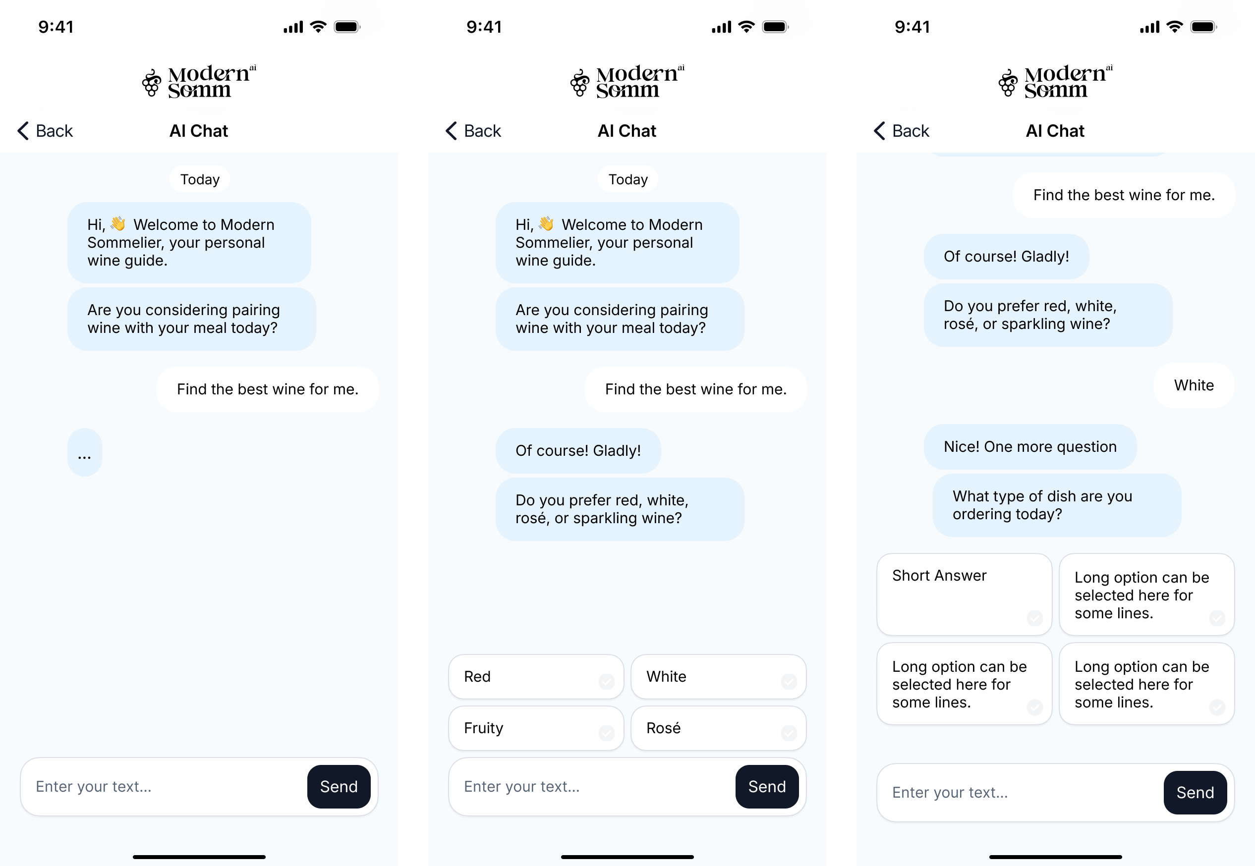
We designed the app around two main user scenarios.
First scenario
The first path was a simple 5-step guided flow. Users who might feel less confident with tech or just unsure how to start could answer a short series of multiple-choice questions. This acted as a friendly guide, helping them quickly reach relevant wine suggestions without needing to “figure out” how to talk to an AI.
Second scenario
The second path was a more flexible chat experience. Here, users could type freely and interact with the AI however they wanted. During design workshops and close collaboration with developers, I pushed for an additional option, pre-built answers inside the chat. This way, users could either write in their own words or select suggested replies. It gave the conversation structure, reduced friction, and still left room for personal choice.
Both paths complemented each other: the guided flow supported hesitant users, while the chat with selectable answers gave more confident users freedom without losing direction.
Initially, the chat was designed to work as a straightforward messenger-style dialogue: the user types, the AI responds. While this approach felt natural, it also created extra friction for people who wanted quick results without spending time typing.
I suggested adding predefined answer options directly into the chat. At first, this idea met resistance, after all, we already had a guided flow with multiple-choice questions, and the team felt it might duplicate functionality. However, I argued that this was not about duplicating, but about giving the user flexibility.
Predefined answers inside the chat would allow two things:
- Save time for the user, no need to type every response manually.
- Make AI replies more accurate, structured input helps guide the conversation and reduces misunderstandings.
To facilitate discussion with the team, I also prepared sketches showing different answer lengths and formats, from very short one-word replies to more detailed options. This helped us see how the interaction would feel in real use and sparked valuable conversation about balance between speed and clarity.
To bring the idea to life, I created an interactive MVP prototype. The goal was to show how the app actually feels in use: from onboarding to chat-based wine recommendations. The video demonstrates the full flow, giving a sense of how users move through the experience, and how the interface supports both guided steps and free chat. This early prototype helped the team validate core interactions quickly and align on next steps before investing in development.
03
Areas for Improvement
Conclusion
What I Would Improve
Looking back, there are a few things I would improve in the next iteration. I would simplify the onboarding even further. While five steps worked for most users, some still felt it was a bit long, and shortening that path could help reduce drop-offs.
I would also make the conversation feel more natural. The predefined responses performed well, but giving users more flexibility to express themselves in their own words would make the experience feel more human.
Personalization is another area I would expand. Recommendations could take into account not only the dish itself, but also the context, such as the occasion or the user’s budget.
Finally, I would test the product in real restaurant environments. Piloting it with actual diners and staff would likely reveal practical usability insights that are hard to fully capture in prototypes.
Next
Case
Digital Product Designer
My LinkedIn